Testing the Library and Academic Services Website
Earlier in the fall term, we arranged for a small sample of students to review and critique our new Library and Academic Services website. Since we had redesigned the site last summer, we were wondering how it was performing.
In our site redesign we used principles of user centric design. In a nutshell, we attempted to create a site for our users, who were defined in two personas: “Average Student User” and “Average Instructor User.”
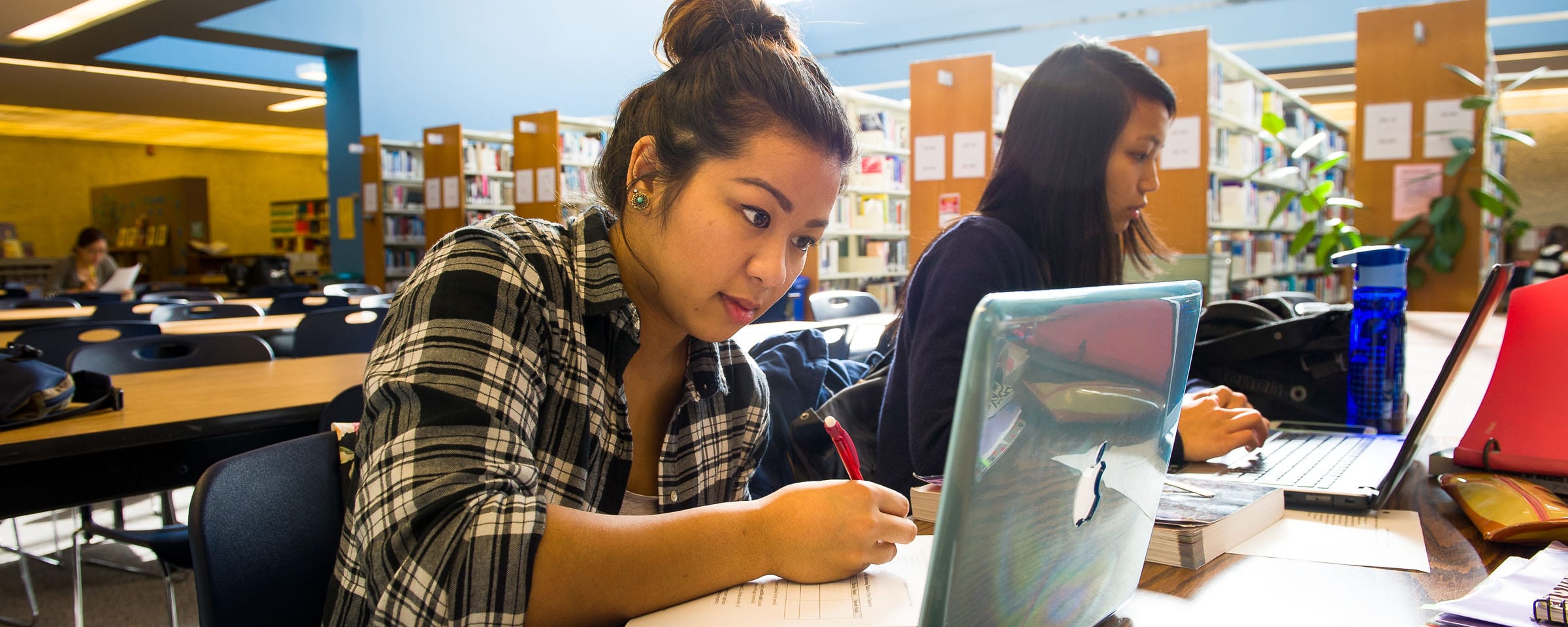
This particular test targeted students.
Our Academic Support Coordinator, Melissa Coyle, arranged for meetings with students. Melissa designed the test questions (with input from Linda Fox and Mark Nelson), and she facilitated the meetings, which were formatted in a focus group format, and included a standardized set of questions and a slate of tasks she asked students to perform on our web site.
The students were chosen from different programs and with varying tech literacy and language skills.
There were two sessions for each student. An individual meeting (in Webex) where each peer tutor met with Melissa for 1-hour to complete a list of twenty-three tasks. Afterward, all students met in a group meeting, where the whole group met (in Webex) and discussed, provided feedback, and shared ideas.
In some cases the questions were designed to discover the accuracy of our student persona. In other cases the tasks were prescribed to see if students could satisfy a task, again based on their persona. I.e. Average students wants to “Discover and attend Library and ASC workshops.”
The facilitator used some “Guiding Questions,” to focus on some specific topics:
- Is the website well-organized and easy to navigate?
- What do students expect to find on the website?
- Which features and tools are most helpful?
- Are the names for each service clear?
- What tasks are most difficult for students and how can we fix this?
We immediately learned that students felt our top navigation menu was well-named, well-organized, and easy to navigate. The search panel was well-noticed and easy to interact with, and use. Students felt the icon panel presented a clear way to navigate to important places, and it broke down language barriers.
In response to the question, “What do students expect to find on the website?” we discovered many points that were contained in our Student Persona. For example “conducting research for a paper that requires sources for information,” “asking a question,” learning about “copyright,” discovering “Library hours and locations,” “finding a tutor,” and “learning about Library services.”
Tasks
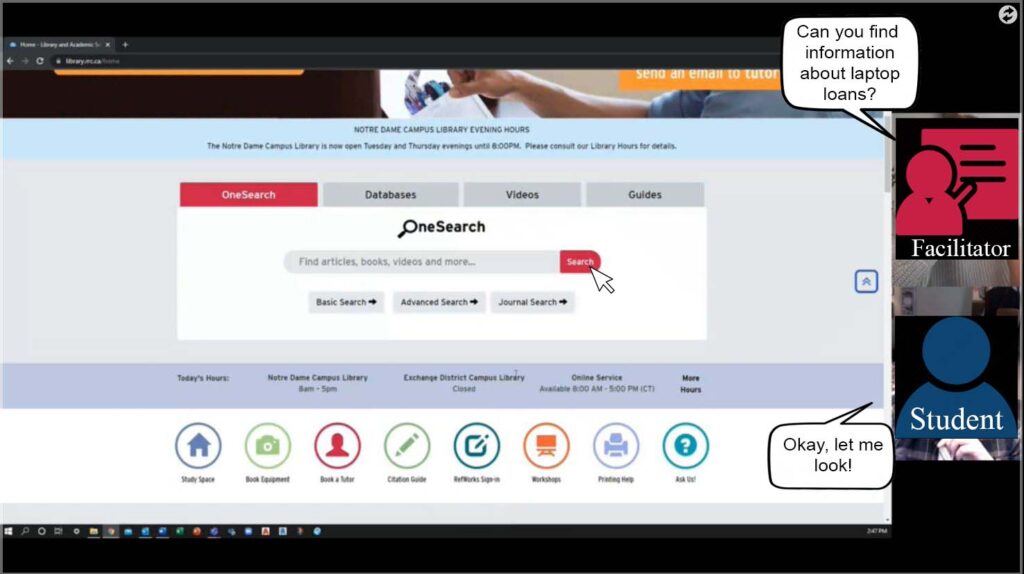
The facilitator asked the students to attempt a slate of twenty-three tasks. The tasks were important, because they showed whether a student could actually use the website for the purpose it was intended. Interestingly, the technology for accomplishing this type of test was made easy by WebEx and the ability of the student to share their screen while the facilitator monitored their progress.
In our testing, some of the tasks we asked students to complete immediately indicated that adjustments were necessary.
In trying to find the “Inter-Library Loan” service, we discovered that students simply identified it as a “request” service, which we also have a page for on our web site. Of course, from a student’s point-of-view these are both “requesting” services, and should be found in the same place. It seems it is only Library staff who consider these two services to be vastly different.
Our new icon bar was well used, however we discovered some changes were necessary. For example, the “Book Equipment” icon took our patrons to a booking form, when it would have been better to send users to a page that described what equipment can be booked (which has a link to the booking form.)
On pages like “Browse & Borrow,” we discovered there is a perception of the importance of the photo tiles being much greater than the icon panels. We thought this was probably true, but it just confirmed that we need to keep important items as photo tiles and move less-important options into the icon panel area.
We also discovered that “Guides” is a generic term used by Library staff, and a student does not know to click “Guides” unless an Instructor had previously used that term to describe the content on the web site. Students felt that the term “Program Guides” might alert them that there are program specific resources on the site.
Students looked for past events on our web site, especially when looking for workshops or sessions that may have been recorded. We did not have a good way for students to accomplish this task.
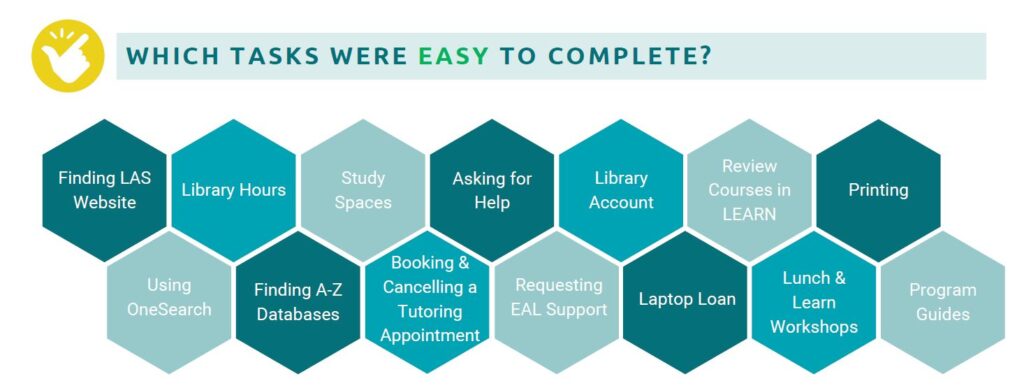
It was also noticed that the easiest to complete tasks had an icon or image tile available on the homepage, demonstrating the power of these sub-navigation areas.
Conclusion
When we build a web site, we think we can do plenty by considering how users will interact with the site. However, until we have some real users try the site, and we watch how they do it, we cannot know the whole story.
At RRC we did this testing with a relatively small set of four students. Truth be told, we may have learned more if we had included more students in our test. However, a study by the Nielsen Norman Group discovered that the amount discovered in such a test does not greatly increase when you add more individuals to the test. In fact, they found the magic number is five.
So, grab some users and test your web site. You will learn so much!
Mark Nelson
Library Systems Specialist
Red River College Polytechnic