RRC Polytech’s visual identity system is designed to reflect who we are as an institution — diverse in audience, purpose and lived experience, yet unified by shared values, standards and aspirations.
To do this well, we use three complementary visual identities:
These identities are distinct but integral. Each exists to authentically serve its primary audience and cultural context, while remaining clearly and intentionally connected to the broader RRC Polytech brand.
This approach is neither new nor experimental. Many organizations have successfully worked with multiple visual identities for decades, and this model reflects best practices in brand architecture — particularly in environments where cultural respect, audience relevance and trust are essential.
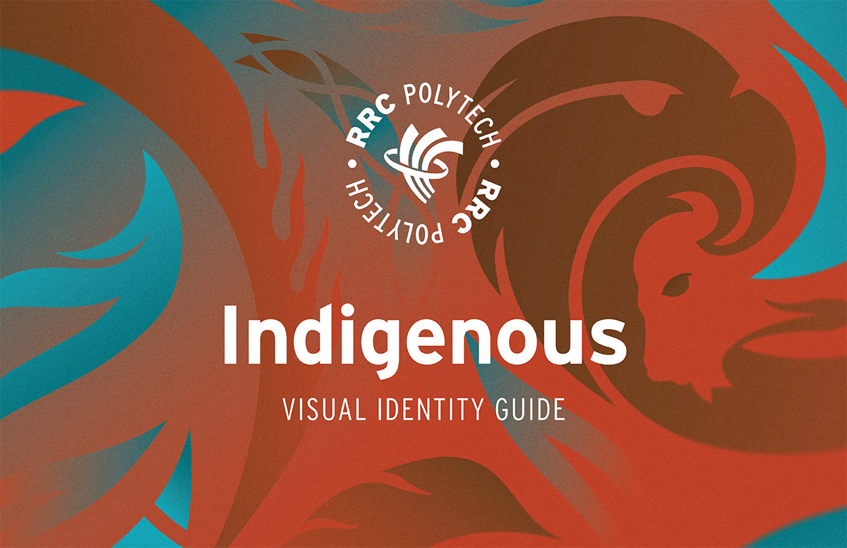
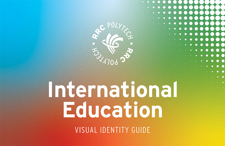
Each visual identity is used intentionally, based on audience, context and content:
While each identity has its own visual language — including colour palettes, graphic elements and storytelling approaches — they share a common foundation. This foundation includes core brand elements such as the RRC Polytech logo, typography, writing style, photography approach, iconography and digital structure. These shared elements ensure consistency, recognition and cohesion across the Polytech, regardless of which identity is leading.
Rather than competing with one another, the three visual identities are designed to work in harmony — much like choosing the right voice, imagery or tone for a specific audience. The decision to lead with one identity over another is guided by intent and respect, not hierarchy.
This model allows RRC Polytech to be both inclusive and precise — acknowledging that different communities engage most meaningfully when communications reflect their lived realities, histories and cultural contexts.
Where rules, standards, or practices are consistent across all three identities — such as logo usage, typography, layout principles, accessibility standards and writing conventions — they are not repeated in all three guides. To keep this system practical and easy to apply, shared visual identity rules are documented once, in the Corporate Visual Identity Guide.
This approach reduces duplication, avoids confusion and supports consistent application across teams, while still honouring the distinct purpose and meaning of each visual identity.
Together, these three visual identities reflect RRC Polytech’s commitment to authenticity, respect and belonging — ensuring that all members of our community can see themselves reflected in how the Polytech presents itself to the world.

RRC Polytech campuses are located on the lands of the Anishinaabeg, Ininiwak, Anishininwak, Dakota Oyate, and Denésuline, and the National Homeland of the Red River Métis.
We recognize and honour Treaty 3 Territory Shoal Lake 40 First Nation, the source of Winnipeg’s clean drinking water. In addition, we acknowledge Treaty Territories which provide us with access to electricity we use in both our personal and professional lives.